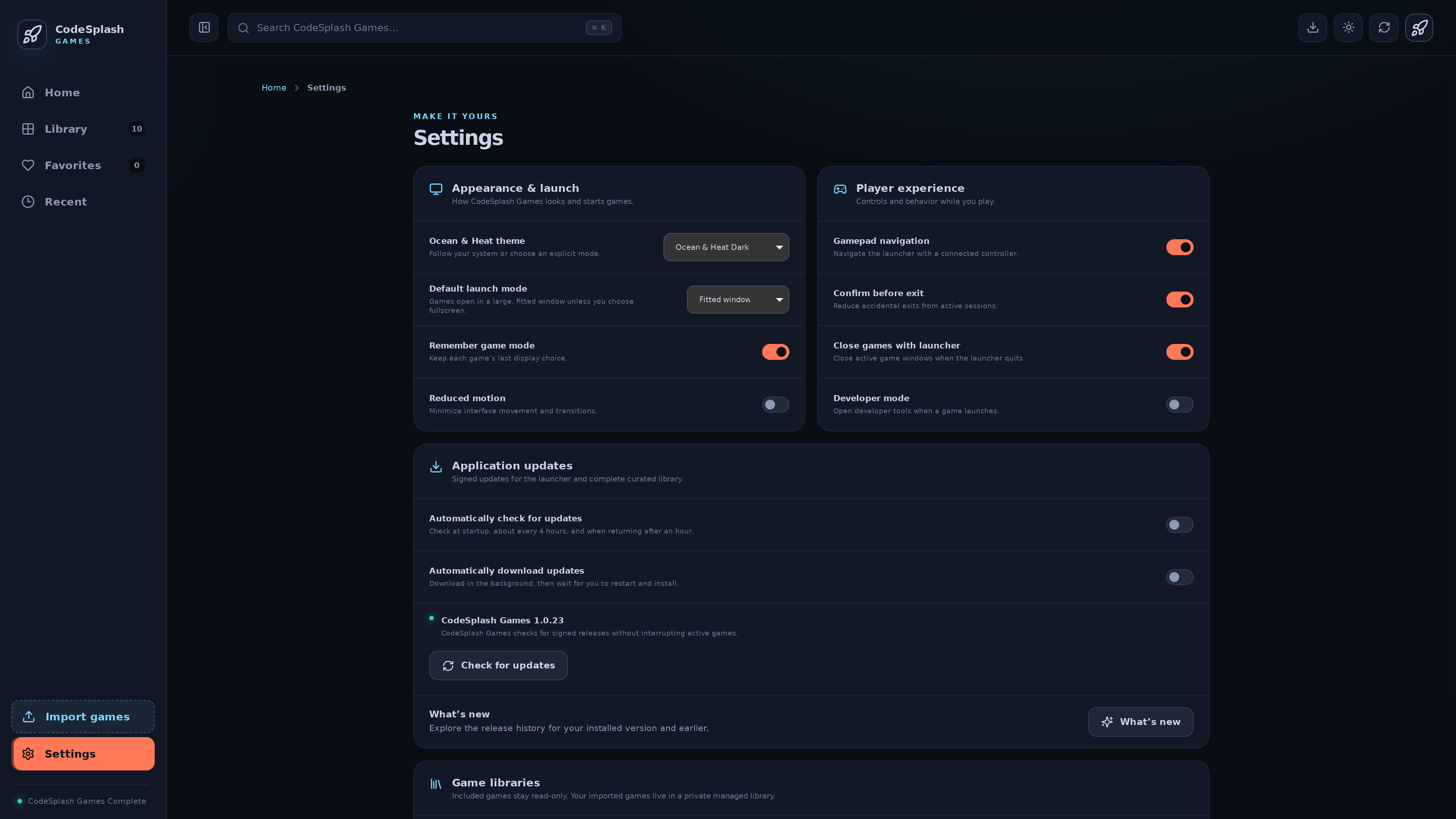
Application updates settings now line up the way they should
CodeSplash Games 1.0.23 is a small patch release, but it fixes a part of the launcher that people actually read: Application updates.
This pass focused on spacing and alignment. In the previous layout, the What’s new area, the last update check time, and the release history rows did not sit quite the same way as the surrounding settings rows. Nothing was broken functionally, but the section read unevenly. In 1.0.23, those pieces now line up more cleanly.
That matters because the updater UI is one of those screens where visual consistency does real work. When a settings page mixes row patterns, padding, and text alignment, it slows down scanning. You feel it most in release notes and update status, where the whole job of the screen is to answer simple questions quickly: what changed, when did the app last check, and what versions are in the release history?
What changed in 1.0.23
This release stays tightly scoped to the Application updates settings area.
- What’s new now aligns with the surrounding settings layout.
- The last update check time now lines up more cleanly with nearby rows.
- Release history rows use more consistent spacing and padding.
- The overall update-status layout reads more evenly across the section.
There are no new product features in this release. The patch is frontend polish in the desktop launcher.
What shipped in code
The user-facing changes came from a small frontend diff.
In src/styles.css, the release-history-row layout was tightened up:
.release-history-row {
  display: flex;
  min-height: 69px;
  align-items: center;
  justify-content: space-between;
  gap: 25px;
  padding: 13px 20px;
  border-top: 1px solid var(--line);
}

.release-history-row > span {
  display: flex;
  min-width: 0;
  flex-direction: column;
  gap: 4px;
}

.update-last-checked {
  margin: 0;
  padding: 0 20px 20px;
}
Those numbers are the release.
Before this patch, the release-history rows used top margin and top padding to create separation. In 1.0.23, that changed to full row padding with an explicit minimum height and a wider horizontal gap. The row content container also now sets min-width: 0, which helps text behave more predictably inside flexible layouts.
The last update check time also got its own explicit spacing rule. That is a small change, but it is the kind of rule that keeps one line of metadata from looking visually detached from the rest of the settings group.
Why this kind of patch is worth shipping
Small settings fixes are easy to postpone because they do not change the broader workflow. They still matter.
CodeSplash Games already exposes release notes inside the launcher through What’s new and release history. Once that information exists in-product, the presentation has to be solid. If rows drift, if one text block hugs the edge while the next one follows a different inset, the interface feels less finished than the underlying code actually is.
This patch cleans up that mismatch without pretending to be more than it is. The comparison from v1.0.22 to v1.0.23 contains two commits, and the only substantive user-facing changes land in src/styles.css and src/data/release-history.json. That is a good sign for a patch release: narrow scope, clear intent, easy to verify.
Release history got a better frame
One useful detail here is that the release itself is also recorded in the launcher’s own history data.
The new 1.0.23 entry in src/data/release-history.json summarizes the patch as “Consistent spacing in Application updates settings.” Its fix note is equally direct: “Align What’s new and the last update check time with the surrounding settings rows.”
That matches the code diff and keeps the change log honest. There is no attempt to inflate a padding fix into something larger.
For developers building desktop UI
If you work on desktop settings screens, this patch is a familiar kind of maintenance:
- Find the section users scan for status.
- Compare it against the row rhythm used by the rest of the page.
- Replace ad hoc spacing with explicit layout rules.
- Ship the cleanup as a small patch instead of waiting for a larger redesign.
That is essentially what happened here. The update settings UI now has more even row spacing, clearer alignment, and less visual friction around metadata.
Getting the patch
If you are already using CodeSplash Games, update to 1.0.23 and open Settings > Application updates to see the cleanup in context.
If you are not using it yet, you can get the current desktop launcher here: https://codesplash.ai/downloads
Try 1.0.23 and reply with feedback if you spot another settings screen that needs the same treatment.
Feature screenshots
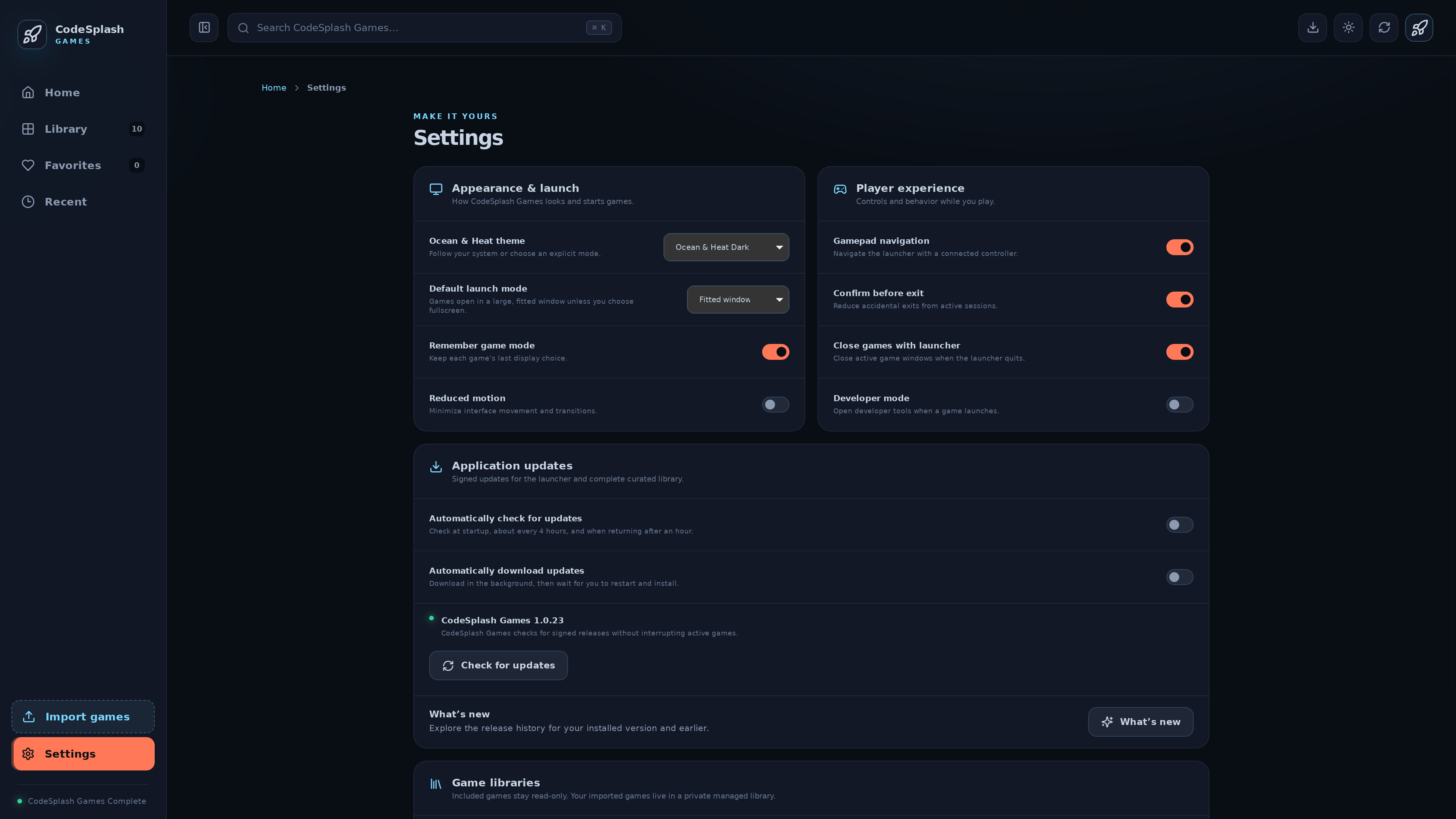
Manage game library and application preferences · View original full-resolution image