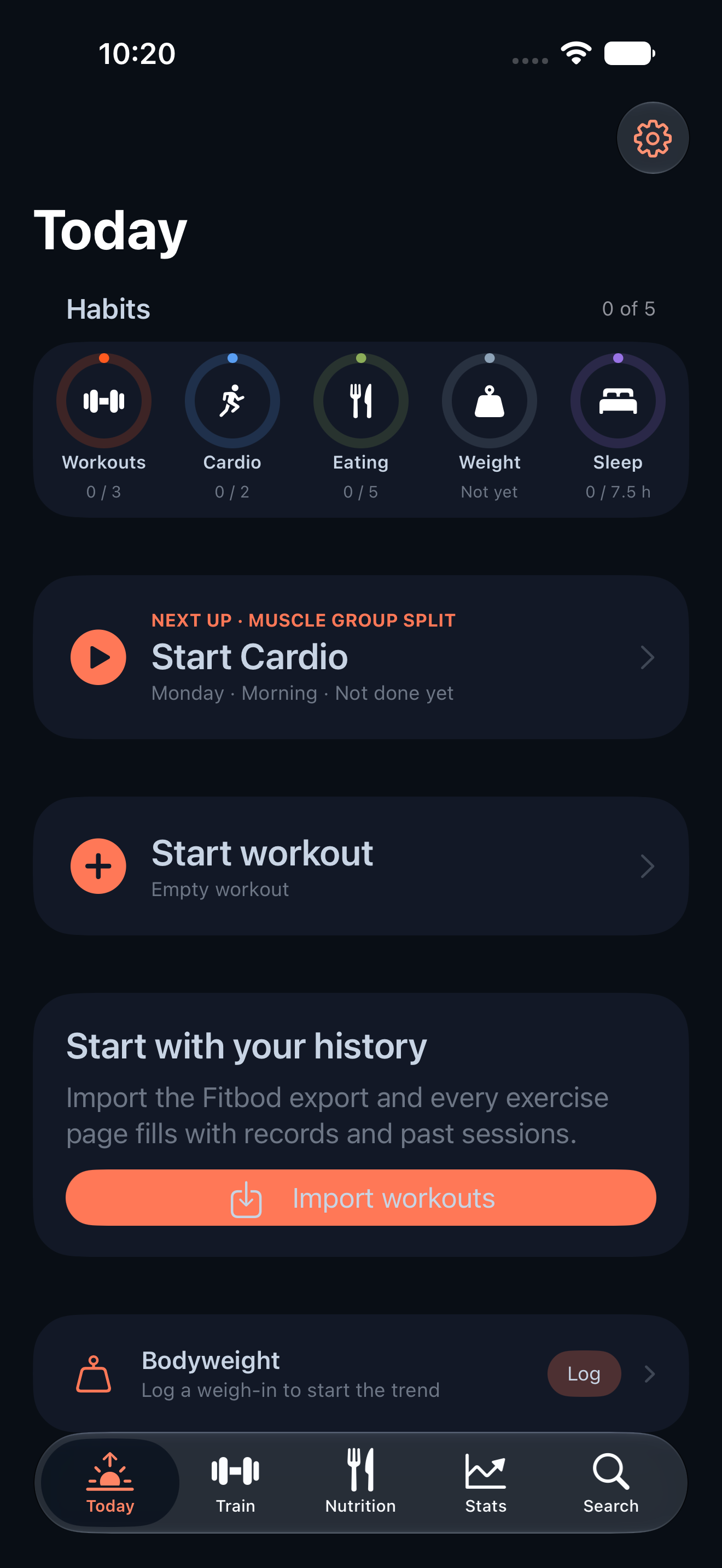
CodeSplash Gym 0.14.1 makes lists and forms feel like the same app
CodeSplash Gym 0.14.1 is a small patch, but it fixes a real product feel problem: moving between sections of the app could still look uneven.
If you log a workout, check a routine, review nutrition, open imports, and then head into settings, you should feel like you stayed inside one app the whole time. In 0.14.1, more native lists and forms now use the Ocean and Heat background treatment consistently, so those transitions feel tighter and less ad hoc.
That matters because Gym is built around repeat use. You are not opening one screen once. You are bouncing between planning, logging, reviewing, and adjusting. Visual consistency reduces friction in exactly those everyday loops.
What changed
This release is a theming update across the native app.
The main change is broader use of the shared Ocean and Heat styling in list-based and form-based screens. Instead of isolated sections carrying the visual treatment while others fall back to a more generic presentation, more of the app now follows the same pattern.
The updated coverage includes existing screens in areas such as:
- routines
- nutrition
- imports
- workouts
- habits
- body logs
- readiness
- settings
Garmin and Fitbit views also got the same pass, so those sections better match the rest of Gym.
There are no new features here, and no new wearable capabilities. This patch is about UI consistency.
What this looks like in daily use
The best way to describe 0.14.1 is by the path a regular user takes.
You might start in Routines to check what you planned. Then open a form to adjust something in a template or program. From there, you could switch to Workout and log your active session. Later, you might review Nutrition, open Imports, or check Habits and Readiness.
In 0.14.1, more of those screens now share the same Ocean and Heat background treatment instead of feeling like separate styling islands.
That includes the kind of places where inconsistency stands out fastest:
- list-heavy views
- editor and sheet flows
- utility screens that sit outside the main training loop
- wearable sections like Garmin and Fitbit
The result is not a redesign. The workflows stay the same. The app just feels more cohesive while you move through them.
Shared theming matters more than one-off cleanup
One useful detail behind this release: the update was not limited to a single screen or one feature area.
The release touched a wide set of views across the app and expanded shared list theming support so the same visual treatment can be applied more consistently across sections. That is the kind of design-system work that tends to pay off twice.
First, the screens you use today look more aligned.
Second, future list and form surfaces have a clearer path to match the same style without custom cleanup each time.
For a product like Gym, that matters. The app has a lot of practical surfaces: exercise pickers, food sheets, body logs, readiness views, imports, wearable reports, settings, and routine editors. If each one drifts visually, the product starts to feel stitched together even when the underlying workflow is solid.
This patch pushes in the other direction.
Screens that got attention
The release notes call out a broad set of existing screens, and the changed areas back that up.
A few concrete examples from the update:
- Routines views now better match the shared visual style.
- Nutrition screens, including list and sheet flows, were part of the theming pass.
- Import views were updated to fit the same treatment.
- Active workout and related workout screens were included.
- Habits, body, and readiness views were brought closer to the same visual system.
- Settings screens also picked up the polish.
- Garmin and Fitbit sections were refined so they fit more cleanly with the rest of the app.
That range is what makes this patch noticeable. Even without a new headline feature, consistency becomes visible when several core paths all improve at once.
Why ship a patch like this
Because polish compounds.
When an app helps you log lifts, follow routines, track food, and review habits over time, the experience depends on repetition. Small visual mismatches are easy to ignore in isolation. They are harder to ignore when you hit them every day.
0.14.1 smooths out more of those edges.
It is also the right size for a patch release. The notes do not claim new workflows or logic changes, and this article should not either. What shipped here is a focused UI consistency pass across existing screens.
If you spend a lot of time in Gym, that kind of update is worth making.
Try it and look around
After updating, open the screens you use most often and pay attention to the transitions between them: routines, nutrition, imports, workouts, wearables, habits, and settings should now feel more visually unified.
You can find CodeSplash Gym here: https://codesplash.ai/downloads
Try 0.14.1 and reply with the screen that feels most improved.
Feature screenshots
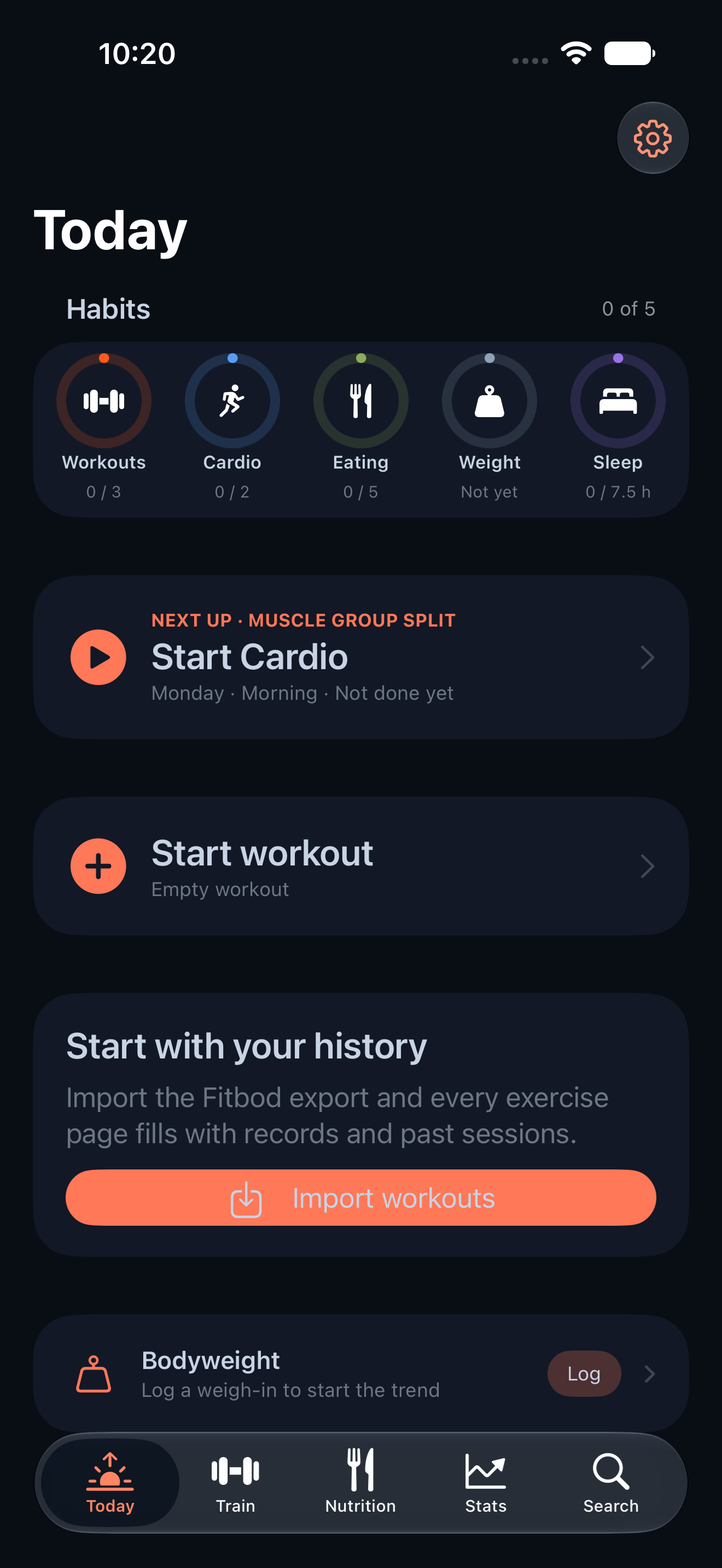
Gym feature today on iPhone · View original full-resolution image
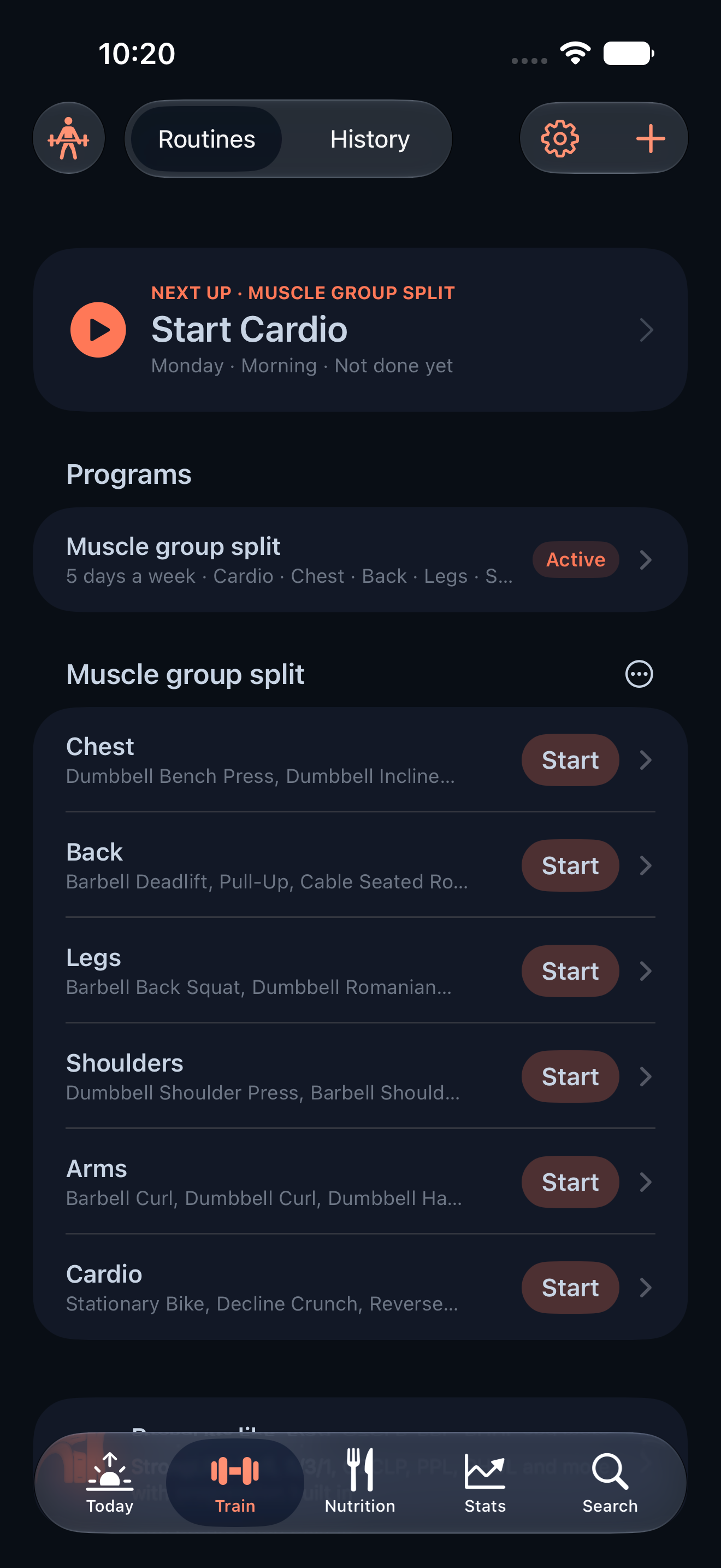
Gym feature train on iPhone · View original full-resolution image
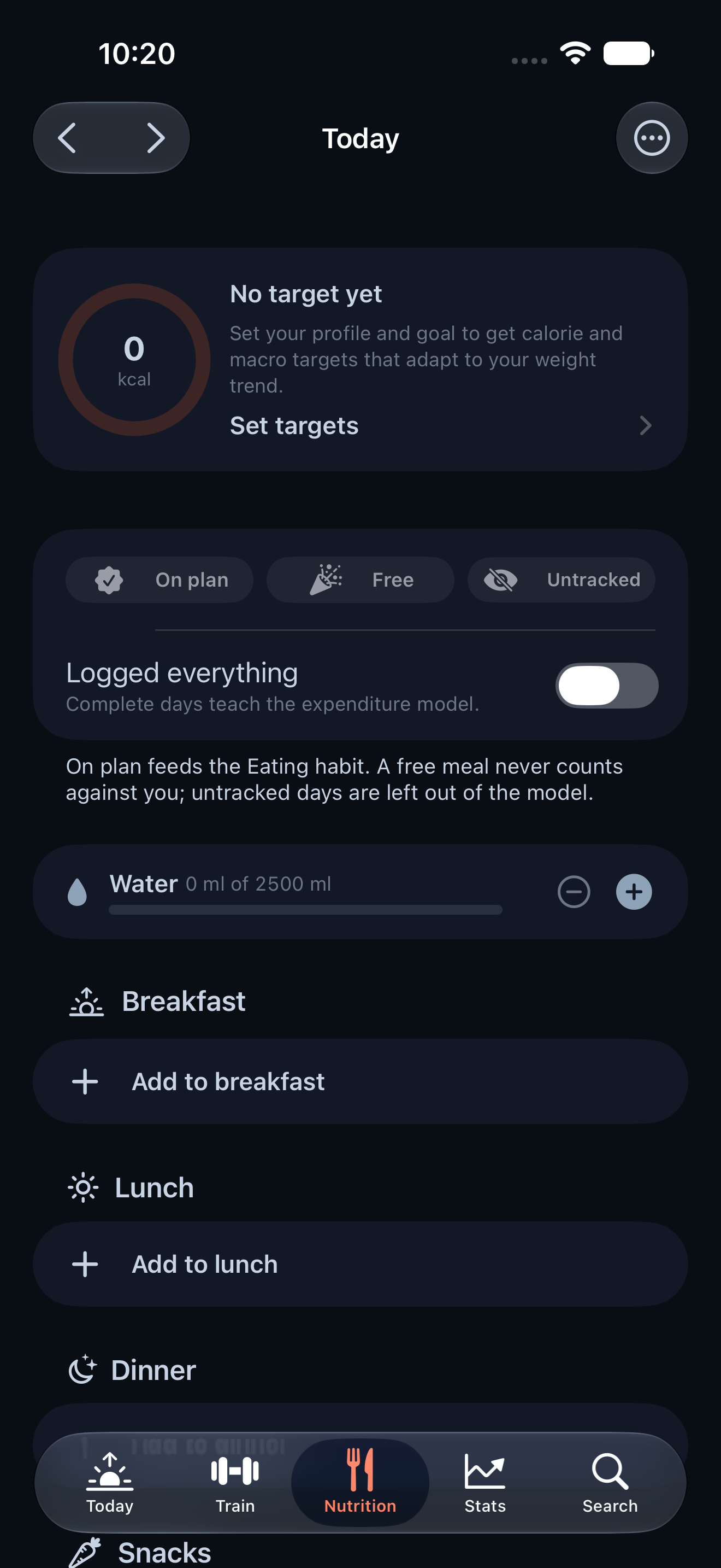
Gym feature nutrition on iPhone · View original full-resolution image
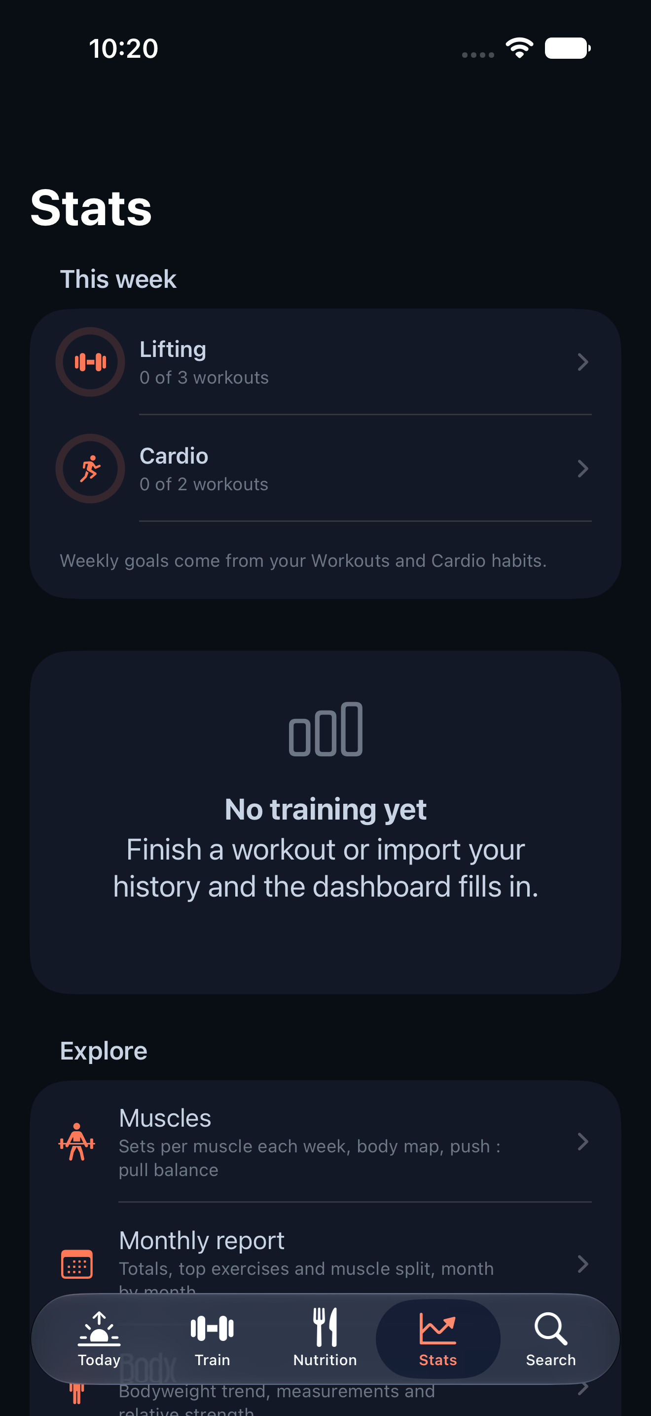
Gym feature stats on iPhone · View original full-resolution image